
Originally published at braginskyoleg.com.
How to stand out amongst dozens of candidates when showcasing your profile to the hiring company? With the founder of the School of Troubleshooters, Oleg Braginsky, and student Maksim Golub, we’ll figure out what it takes to revamp and optimize the one’s resume to make it work for them 24/7.
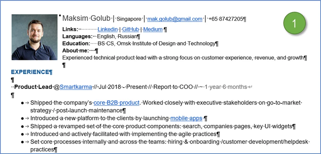
At a certain point in the career, it was decided to start looking around for more opportunities in the wild lands of the market and update my resume to reflect the actual state. Unfortunately, the latest version neither looked good nor stood a chance of getting attention. Neatness with grammar were off too (1).
We started with a plan. The first step was to get together all the details. Second, set a solid structure, get a good quality headshot showing a smiling person ready to tackle any challenges. The last few steps were to optimize the content to increase the discoverability. The final structure looked like this:
-
photo, contacts
-
about section in two versions
-
education grades with courses
-
skills that the candidate has behind the belt
-
work experiences with the title, dates, and key achievements including projects.
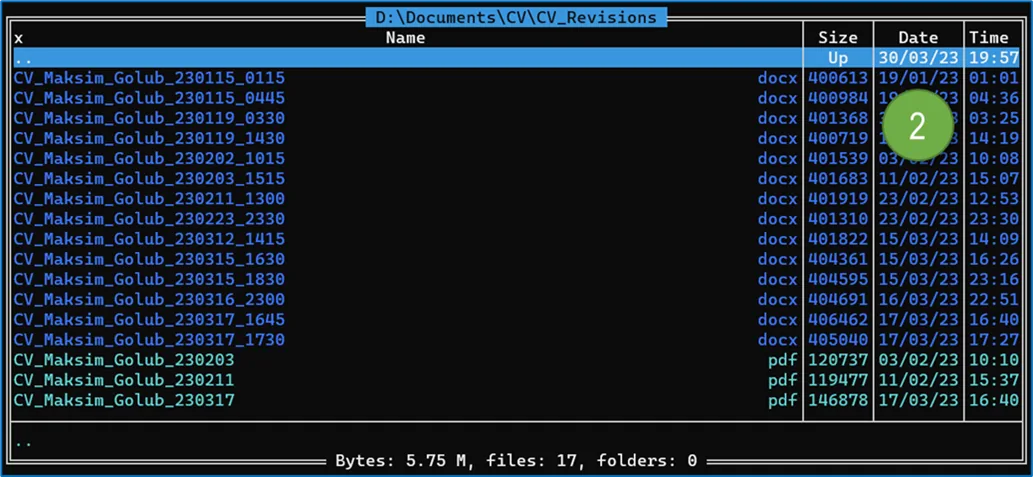
Each document should be neat: created a table with sections, respecting margins for printing. Revisions were stored in the backup folder. Formatted filename in Japanese style. PDFs were adjusted versions for specific companies. There we cut the time in the filename for non-corporate recruiters (2).
To make an initially positive impression beforehand, Maksim engaged a professional photographer, rented a studio where he has been putting a smile on his face for two hours straight. The long-forgotten skill of tying knots came in handy as well. Received a set of high-resolution photos shortly after (3).

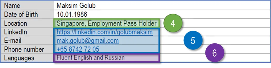
Contact information’ block was next. Gave each parameter a single line. Added a quick answer to visa status to save time (4). Made links clickable (5). Used a unique URL from WhatsApp for phone numbers, allowing to reach out to the candidate in one click. Combined «Languages» to save space (6).
The «About» section had two versions. The long one is intended for LinkedIn, with around two thousand characters in total. The latter and shorter one would stay on the resume itself. For some countries, it is common to use the third person voice to describe yourself. We picked the option to speak directly (7).

The skills section held five items: soft skills, product-related, project management, technical knowledge, design. The reasoning behind such hierarchy: personality comes first, domain-relevant goes second, managerial skills right after. On top of that, an ability to do a real work with data, code, wireframes (8).

Work Experience should give an idea of what we’ve been up to throughout our careers. Plain formatting to keep it lightweight without putting unnecessary accents. To save time on research, each company had a link to it’s website. In case the business doesn’t exist anymore, the link points to the LinkedIn profile.
The section included the following items: company name, short description to help the reader (9), title within the organization (10), work experience, preferably with the output, outcome and numbers attached to it (11) followed by the work tenure in shortened format (12).

There was an idea to add a logo for each company. It was backlogged as a low-priority, little-impact item, given that we wouldn’t know which app the viewer will use and whether it looked good there. The second consideration is that logos could be horizontal or vertically oriented, affecting the layouts aesthetic.
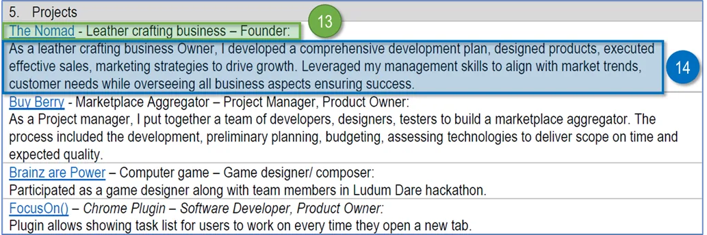
The list of projects included initiatives that the person participated in. Set two versions for it. Short one had links (13) with few details (14). The long one was enriched with the achievements and details description. Picked relevant side projects, reserved job-related ones for the future articles.
It came time to optimize the content for readers and search engines by their frequency with uniqueness. Output generated a color-coded text: the higher the frequency, the warmer the colour. Rare words got colder shades. Learned that LinkedIn interprets characters like “|” as OR (15). Ruthlessly removed them.
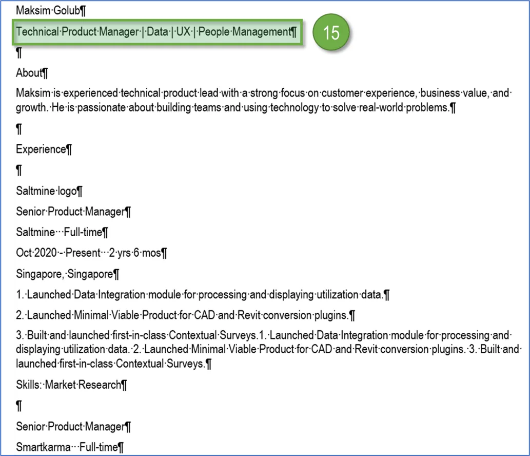
Combined the content into a flat file, added the information of skills. After running through the script, we saw a variety of colours, predominantly warm ones, indicating high frequency of words. Turned the ruthless mode to the maximum, played with the forms, replaced phrases, shortened the text (16).
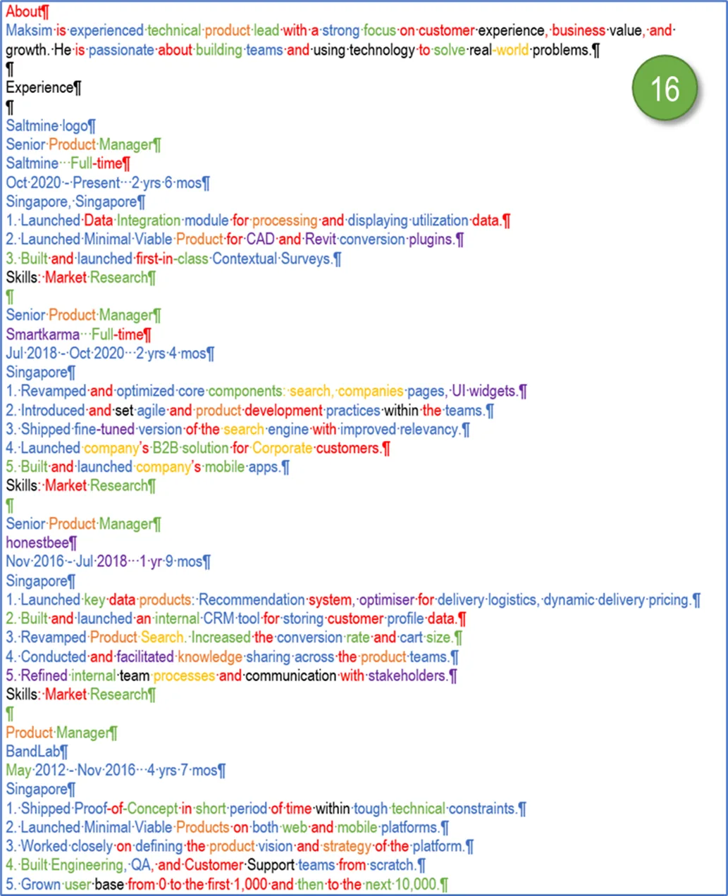
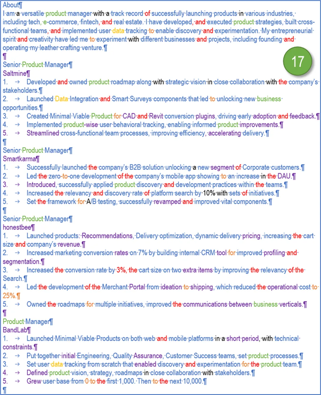
Did four iterations of adjustments, 30 minutes each. Every round made target document leaner, showing there was more to squeeze out. We finally got a copy majorly in sub-zero colours. Decreased the words count from 8,290 to 6,199. Filled it back in into both the initial document and LinkedIn profile (17).
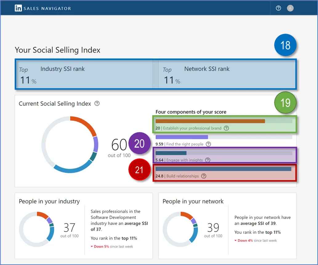
To mark the point, we took a snapshot of LinkedIn Social Selling Index. Being on the way to top 10% (4) was a motivation for further achievements (18). While the score for establishing a profile was not that bad (19), along with the network’s strength (21), the engagement rating required more efforts to put in (20).
As an outcome, the updated LinkedIn profile allowed attracting more interest, increased the number of messages regarding potential job opportunities. It was one of the contributing factors to starting a conversation that led to landing a job offer with a higher position and better terms.